

epiLocal Free Chart Maker Review 2026
Review epiLocal Free Chart Maker for column, pie, and statistics charts, and when to switch to a fuller editor.
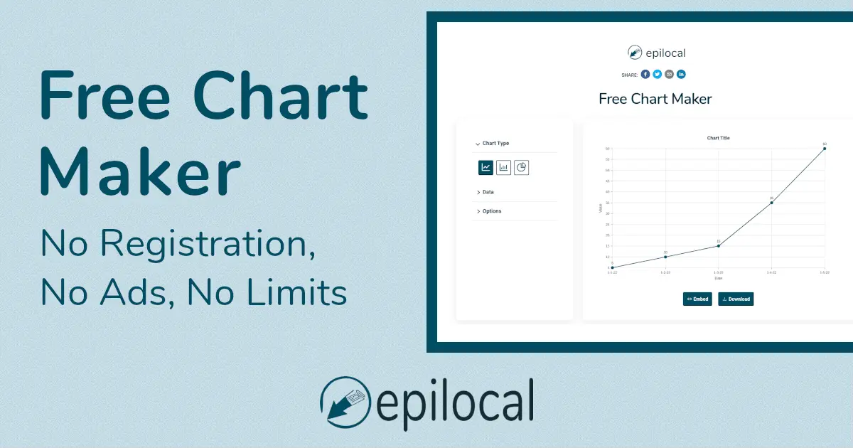
If you simply need to turn CSV data into a line graph, column chart, bar chart, pie chart, tally graph, or basic statistics chart, epiLocal Free Chart Maker takes a very direct approach: no registration, no complicated templates, no full design-suite workflow. Paste your data, edit the chart colors, then download a PNG or copy SVG embed code.
Bottom Line
epiLocal Free Chart Maker is best for lightweight, fast, publishable charts. It is not a data analysis platform, and it is not a visual design tool like Canva. It is closer to a small utility: when you already have clean CSV data and need a quick free chart generator for a website, WordPress post, blog article, or social post, it gets the job done with very little friction.
Its core advantage is low setup cost: no registration, CSV input, support for line graphs, column charts, bar charts, pie charts, PNG downloads, and SVG embed code for websites. Its limits are equally clear: few chart types, basic styling options, and no serious support for complex data cleaning, interactive charts, dual-axis charts, combo charts, or team workflows.
Overall Scores
| Category | Score |
|---|---|
| Speed of use | 8.8 |
| Charting capability | 6.5 |
| Publishing convenience | 8.2 |
| Design flexibility | 6.4 |
| Value for money | 8.9 |
What It Can Do
The official page positions it as a free online chart maker and free chart generator for creating simple, attractive graphs and charts that can be used on websites or shared on social media. It explicitly supports embedding charts as SVG and downloading them as PNG.
The currently described chart types are:
- Line Graph: best for showing how data changes over time.
- Bar Chart / Column Chart: best for comparing categories or quantities across different periods.
- Pie Chart: best for showing how categories make up parts of a whole.
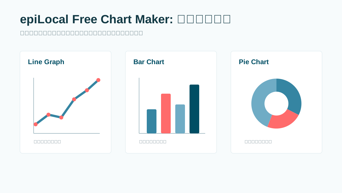
These three chart types cover many common needs in blog posts, lightweight reports, social graphics, statistics charts, tally graphs, and operations recaps. If the goal is to explain a trend, a comparison, or a share of total, the tool is usually enough.
Primary topics covered: free chart maker, free chart generator, free column chart maker, statistics chart maker, tally graph maker, pie chart maker, edit chart, WordPress charts, graphs in WordPress, CSV chart maker, SVG chart embed, PNG chart download.
Workflow: A Small CSV-to-Chart Utility
epiLocal describes chart creation in four steps: choose the chart type, input CSV data with headers in the first row, modify colors, background, and label colors, then download a PNG or copy SVG embed code. For users searching for "edit chart," this is the main editing workflow: change the data, select the chart type, and adjust the visual styling before export.
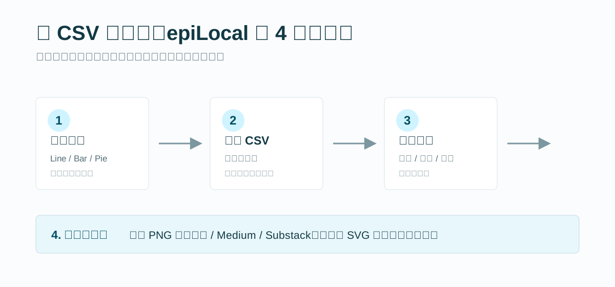
The workflow is easy to understand. You do not need to learn a complex data model or operate a full design canvas. If your data is clean, you can produce a chart quickly. It also fits well with data exported from tools such as Microsoft Excel or Google Sheets.
The tradeoff is that the tool depends heavily on preprocessing. If your dataset has missing values, outliers, complex categories, multiple metrics, or fields that need aggregation, you should clean and shape the data in a spreadsheet or BI tool first. epiLocal is not a replacement for Excel, Google Sheets, Datawrapper, or Flourish.
Export and Licensing: The Part to Watch Closely
epiLocal Free Chart Maker has a clear publishing path:
- For social media, Medium, Substack, and similar platforms, download the chart as a PNG.
- For WordPress charts, graphs in WordPress, Ghost, Webflow, Wix, and other websites or blogs, copy the SVG embed code.
The official page also states that charts created with the tool are covered by the Creative Commons Attribution License. That means the charts can be used for any purpose, including commercial use, as long as credit is given through a hyperlink. If the publishing medium does not support hyperlinks, you need to write Created with epilocal.com/free-chart-maker.
This matters for commercial content. The tool is free, but it is not "no attribution required" free. If you are creating company blog posts, client reports, marketing assets, or landing-page visuals, the attribution requirement should be considered before publishing.
Strengths
1. No Registration, Very Low Friction
Many online tools slow users down with accounts, templates, project spaces, or paywalls. epiLocal goes straight to the task: open the page, choose a chart type, paste CSV data, export. That low-friction experience is useful for one-off needs.
2. CSV Input Is Friendly for Content Teams
CSV is a common handoff format between content, operations, and data teams. For anyone who has already prepared data in Excel or Google Sheets, exporting or pasting CSV into a chart generator is more predictable than dragging visual elements by hand. This makes epiLocal useful as a basic statistics chart maker or tally graph maker when the underlying counts are already organized.
3. PNG and SVG Cover the Main Publishing Scenarios
PNG works well for social media, report screenshots, and most content platforms. SVG works well for websites because it stays sharp and integrates cleanly into page layouts. For a free lightweight tool, those two export paths cover most simple publishing needs, including WordPress charts and blog graphics.
4. The License Is Clear
Free tools often create ambiguity around usage rights. epiLocal states that charts are under a CC BY license: commercial use is allowed, but attribution is required. The attribution rule adds a publishing constraint, but at least the rule is explicit.
Weaknesses
1. Limited Chart Types
The tool focuses on line graphs, bar charts, and pie charts. It does not cover scatter plots, area charts, radar charts, stacked charts, combo charts, dual-axis charts, maps, or other more advanced visualization types.
2. Basic Styling Options
The official page says users can currently modify line, bar, or pie colors, as well as background and label colors. That is enough for everyday charts, but not for strict brand systems, complex annotations, legend layout control, gridline tuning, typography systems, or responsive detail.
3. No Data Cleaning
This is not an analysis tool. If the data is messy, it still needs to be cleaned in a spreadsheet or BI tool first. Otherwise, fast chart generation may simply turn unreliable data into a polished but unreliable visual.
4. Free, but Attribution Is Required
The CC BY license allows commercial use, but the attribution requirement may be inconvenient for some business content. White papers, client-facing materials, commercial reports, and advertising landing pages should confirm whether external tool attribution is acceptable.
Best Fit and Poor Fit
| Recommended for | Be cautious if |
|---|---|
| Personal blogs, content operations, social posts, and lightweight reports. | You need complex interactive charts or multidimensional analysis. |
| Cases where the data is already clean CSV and you only need a publishable column chart, pie chart, line graph, statistics chart, or tally graph quickly. | You need brand-level visual control, complex layout, or team collaboration. |
| Users who want free PNG downloads or SVG embeds. | You cannot accept the CC BY attribution requirement for commercial content. |
| One-off trend, comparison, or proportion charts. | You need long-term dashboards or automatically updated charts. |
Popular epiLocal Use Cases and Search Intent
epiLocal's strongest search fit is not advanced analytics. It is fast chart publishing. Users searching for terms like "free column chart maker," "statistics chart maker," "tally graph maker," "pie chart maker," and "free chart generator" usually want a simple output, not a full BI workflow.
Free Column Chart Maker
For a free column chart maker use case, epiLocal works well when you need to compare categories, counts, or performance across a small dataset. The tool calls this a bar chart, but the search intent overlaps with column charts: visual comparison using rectangular bars.
Statistics Chart Maker
As a statistics chart maker, epiLocal is useful for simple frequency counts, percentages, and trend snapshots. It is not designed for statistical modeling, regression, hypothesis testing, or exploratory analysis. Prepare the calculations first, then use epiLocal to publish the chart.
Tally Graph Maker
For tally graph maker searches, epiLocal can work if your tally counts are already summarized in CSV form. It is best for turning counts into a bar chart or pie chart, rather than collecting the tally data itself.
Pie Chart Maker
epiLocal is a practical pie chart maker for basic share-of-total visuals. It is most useful when categories are limited and the percentages are easy to read. If the chart has too many slices, a bar chart will usually be clearer.
WordPress Charts and Graphs in WordPress
For users searching "WordPress charts" or "graphs in WordPress," epiLocal's SVG embed path is the key advantage. You can generate a chart, copy the embed code, and place it into a WordPress post or page. PNG export is still useful when the platform or theme does not handle embedded SVG cleanly.
How It Compares With Similar Tools
If your goal is to turn CSV into a chart as quickly as possible, epiLocal is a good fit. It is lighter than full design tools, simpler than BI software, and faster than writing chart code from scratch.
If you need more advanced data storytelling, consider Datawrapper, Flourish, Canva, or Google Sheets charts. If you are building maintainable data products or interactive visualizations, libraries such as ECharts, Nivo, Chart.js, or Plotly are a better fit. It is worth noting that epiLocal credits the open-source project Nivo, which suggests the tool benefits from a mature charting ecosystem under the hood.
Final Recommendation
The value of epiLocal Free Chart Maker is speed. It does not try to become an all-in-one design platform. It keeps one task lightweight: input CSV, generate a basic chart, edit chart colors, then export PNG or SVG.
My recommendation is to put it in your content production toolbox, not your data analysis toolbox. It is good for turning already-verified data into publishing assets. It is not the right tool for data cleaning, complex analysis, or highly customized brand design. If you can accept the attribution requirement, it is a useful free utility to keep bookmarked.
FAQ
Is epiLocal a free column chart maker?
Yes. epiLocal can be used as a free column chart maker for simple category comparisons. In the tool, this use case is handled through the bar chart option.
Can epiLocal make statistics charts?
Yes, for simple statistics charts such as counts, percentages, and trend snapshots. It does not perform advanced statistical analysis, so the data should be calculated and cleaned before chart creation.
Is epiLocal a tally graph maker?
It can be used as a tally graph maker if your tally data is already summarized in CSV format. You can paste the counts into the tool and convert them into a bar chart or pie chart.
Can I use epiLocal as a pie chart maker?
Yes. epiLocal supports pie charts and is useful for simple part-to-whole visuals. Keep the number of categories low so the chart remains readable.
Can I add epiLocal charts to WordPress?
Yes. epiLocal supports SVG embed code, which can be used for WordPress charts and graphs in WordPress. You can also download a PNG if your WordPress setup does not support the embed cleanly.
Can I edit a chart after creating it?
Yes. You can edit chart data and basic styling options such as chart colors, background, and label colors before exporting. It is not a full design editor, but it covers basic chart editing.
Try in BeCharts
Open ready-made bar charts templates or jump straight into the editor with sample data loaded.