Flourish Alternative 2026: Studio Review
Honest Flourish Studio review for 2026. See pricing limits, box plot and scatter workflows, and when BeCharts is a faster Flourish alternative.
Flourish Studio is a no-code platform for interactive charts, maps, and data stories. Newsrooms, NGOs, and presentation teams use it when the chart itself needs motion, filters, and embeds—not just a static PNG. If you landed here searching for a Flourish alternative, this review covers what Flourish does well, where the free plan stops, and when a lighter chart maker is the better fit.
Bottom Line
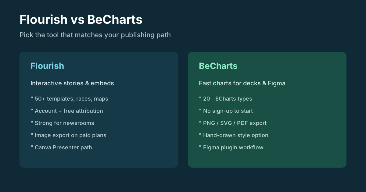
Flourish is strongest as an interactive storytelling tool. You pick a template, bind spreadsheet columns, tune colors and popups, then publish a responsive embed. The free plan unlocks the template library and unlimited projects, but published embeds carry Flourish attribution, and image or SVG download sits behind paid tiers (Presenter via Canva Business, or custom Publisher / Enterprise contracts).
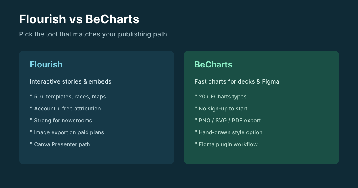
It is not the fastest path if you only need a clean chart for a slide, blog post, or Figma frame. For those jobs, BeCharts is a practical Flourish alternative: open the editor, paste data, choose from 20+ chart types (including a box plot maker, scatter, radar, and network-style graph), then export PNG, SVG, or PDF without creating an account.
Keep Flourish when you need bar chart races, rich maps, scrollytelling, or live interactive embeds for a news site. Switch when you want special charts for decks and design tools with less publishing overhead.
Overall Scores
| Category | Score |
|---|---|
| Interactive storytelling | 9.1 |
| Chart / template variety | 8.8 |
| Ease for non-coders | 8.4 |
| Free-plan export value | 5.8 |
| Speed for one-off charts | 6.5 |
| Fit for Figma / static decks | 5.5 |
| Value for newsrooms | 8.7 |
What Flourish Does
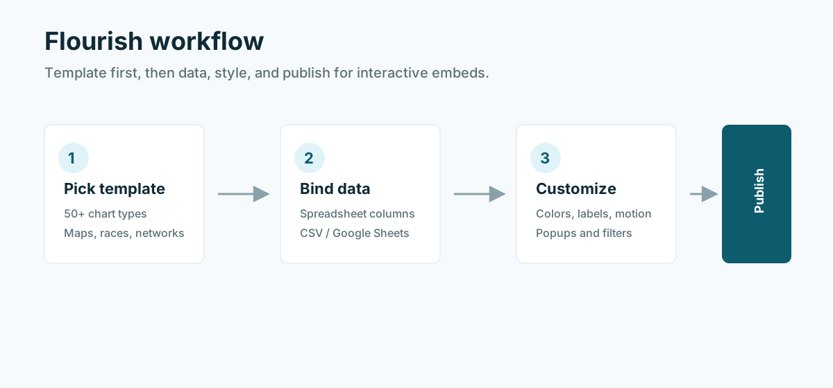
Flourish centers on templates rather than blank canvases. Typical steps:
- Create an account and open the template library (50+ charts, maps, and story formats).
- Upload or paste data, then map columns to the fields the template expects.
- Customize colors, labels, annotations, popups, and optional animation.
- Publish a public URL or embed; on free plans, attribution stays on the graphic.
That model fits teams that already think in “visualization projects”: a segmented bar chart for survey results, a radial graph for hierarchical shares, an interactive network for relationships, or a table chart for sortable rankings. Flourish also documents specialized guides (for example box plots and radial charts), which is why many people discover the product through maker-style searches.
Primary topics covered: Flourish alternative, Flourish Studio review, box plot maker, scatter graph maker, bar chart generator, radar diagram, interactive network, radial graph, segmented bar chart.
Key Features
Template library and special charts
Flourish’s library goes beyond basic line and pie charts. Users reach for it as a bar chart generator or bar chart creator when they want races and animated bars, as a box plot maker / box and whisker plot maker for distribution summaries, and as a home for special charts that feel hard to build in a spreadsheet alone. Segmented bar graphs, radar diagrams, scatter diagram makers, and interactive network templates sit in the same chooser.
Interactive embeds and stories
Published projects respond to hover, filters, and screen size. Multi-slide stories and (on higher plans) scrollytelling are built for articles and reports where the reader explores the data in place. That is a different job from exporting a single SVG for a pitch deck.
Spreadsheet-friendly data binding
Data entry feels familiar if you work in Excel or Google Sheets. Column mapping is the main skill: once fields line up with the template, the preview updates without writing chart code.
Free plan with clear upgrade gates
The free tier is generous on creation: unlimited visualizations and stories, private drafts until publish, and the full template set. Limits show up at publish and export—attribution on embeds, no image/SVG download on free, no team branding, and advanced storytelling features reserved for paid plans. Presenter access is tied to Canva Business or Enterprise; Publisher and Enterprise pricing is sales-led.
Canva and presentation path
For teams already in Canva, Flourish’s Presenter path lets interactive charts live inside designs and PowerPoint workflows. That is useful when the destination is a branded deck rather than a news CMS.
Strengths
- Broad template coverage for interactive and animated visuals, including maps and network charts
- Strong defaults for public-facing storytelling without writing JavaScript
- Free creation and experimentation with privacy until you publish
- Responsive embeds that work across desktop and mobile
- Clear documentation and template-specific guides for makers (box plots, radial graphs, and more)
Weaknesses
- Sign-up required; slower than no-account chart utilities for one-off graphics
- Free embeds include Flourish branding; white-label needs paid plans
- Static image / SVG export is not on the free plan—awkward for print, Slack, or Figma paste
- Publisher-tier pricing can be steep for small teams that only need occasional charts
- Overkill if you only need a bar chart generator or scatter graph maker for a single slide
Comparison at a Glance
| Tool | Sign-up | Best for | Export on free tier |
|---|---|---|---|
| Flourish | Yes | Interactive stories, races, maps, news embeds | Public embed with attribution; no image/SVG |
| BeCharts | No | Fast charts for blogs, decks, Figma | PNG, SVG, PDF from the editor |
| Datawrapper | Yes | Clean news charts and locator maps | Strong free embeds; paid for some branding |
| Visme | Yes | Branded decks and design suites | Freemium limits on templates/exports |
| ChartGo / epiLocal | No | Quick static line/bar/pie | PNG or simple embeds |
BeCharts vs Flourish
| Need | Prefer Flourish | Prefer BeCharts |
|---|---|---|
| Interactive article embed | Yes | Use static export + article layout |
| Box plot / scatter / radar for a report | Possible via templates | Direct boxplot, scatter, radar makers |
| Bar chart race or live map story | Yes | Not the primary job |
| Hand-drawn or ECharts-style polish | Limited | Built-in styles + deep customize |
| Figma chart plugin workflow | Canva path instead | BeCharts + Figma |
| No account, ship in minutes | No | Yes — Start in the editor |
Who Should Use Flourish
Great fit for: data journalists, NGOs, educators building interactive lessons, and presentation teams that want filters, races, and embeds without hiring a front-end developer.
Not a great fit for: anyone who only needs a static box plot generator, scatter graph maker, or segmented bar chart for slides; designers living in Figma; or teams that refuse attribution and cannot budget Presenter or Publisher.
If your searches look like “box and whisker plot maker,” “boxplot maker,” “scatter diagram maker,” or “radar diagram” and the deliverable is a file—not a live story—try BeCharts templates first, then open Flourish only when interactivity is the product.
Final Word
Flourish Studio remains one of the best no-code tools for interactive data visualization in 2026. Treat it as a publishing platform for stories, not as a free PNG factory. When you need a Flourish alternative for speed, offline-friendly exports, or design-tool workflows, BeCharts covers everyday and special chart types without the account and attribution overhead—then send readers to Flourish when the story must be interactive.
Try in BeCharts: Online editor · Box plot maker · Bar charts · Scatter · Radar · Graph / network
FAQ
Is Flourish free?
Yes, with limits. Free accounts get unlimited projects and the full template library. Published embeds show Flourish attribution, and downloading PNG, JPEG, or SVG requires Presenter (via Canva Business) or a higher paid plan.
What is the best Flourish alternative for static charts?
For slides, blogs, and design files, BeCharts is a strong Flourish alternative: no sign-up, CSV-friendly data editing, and PNG/SVG/PDF export. Keep Flourish when you need interactive embeds, races, or maps.
Can Flourish work as a box plot maker or box and whisker plot maker?
Yes. Flourish has box plot visualization templates aimed at distribution views. If you only need a downloadable boxplot for a report, BeCharts’s box plot maker is usually faster.
Does Flourish include a bar chart generator and segmented bar chart?
Yes. Flourish supports bar charts, races, and segmented (stacked) bar graphs through templates. BeCharts covers grouped and stacked bars on the bar template page when you need a static bar chart creator.
Can I make a scatter graph or scatter diagram in Flourish?
Flourish includes scatter chart templates suitable for correlation-style views. BeCharts offers a dedicated scatter plot maker when the output is an image or SVG for decks.
Is Flourish good for radar diagrams and radial graphs?
Flourish documents radar and radial chart patterns and provides matching templates. For a quick radar diagram without publishing an embed, use BeCharts’s radar chart maker; for hierarchical radial layouts, see sunburst.
Does Flourish support interactive networks?
Yes—network chart templates target relationship and node-link views. BeCharts’s graph chart type covers similar interactive-network needs when you want an ECharts-based editor instead of a Flourish project.
How does Flourish compare to Datawrapper?
Both serve newsroom-style visualization. Flourish leans into animation, stories, and a wider template set; Datawrapper is often praised for clean, restrained charts and locator maps. Choose based on whether motion and multi-slide stories matter more than minimalist static clarity.
Do I need Flourish for a table chart?
Flourish can build interactive table visualizations. If you only need a chart beside a simple table in a doc, a spreadsheet plus BeCharts is enough; use Flourish when the table itself must be a filterable, embeddable graphic.
When should I stay on Flourish instead of switching?
Stay if your audience will explore the graphic in the browser—filters, races, maps, or scrollytelling—and your organization can accept free-plan attribution or pay for branding and exports. Switch when the deliverable is a file for Figma, Keynote, or PDF and interactivity is optional.
Try in BeCharts
Open ready-made box plots templates or jump straight into the editor with sample data loaded.