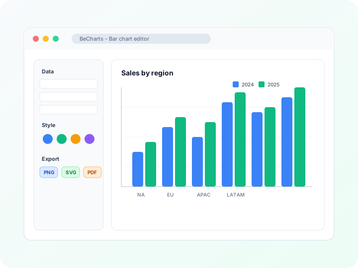
- Equal-width bins for one numeric column
- Bar height shows how many values fall in each range
- PNG, SVG, or PDF export from the browser
- Use a bar graph maker when the axis is categories, not ranges
Ranges, not categories
Each label is an interval, such as 60-70. Bar height is the count of observations in that interval. Gaps between bars stay small so the axis reads as a continuous scale.
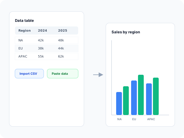
See the distribution
A histogram shows whether values cluster, skew, or spread into the tails. The sample exam scores peak in the 60-70 bin and thin out at both ends.
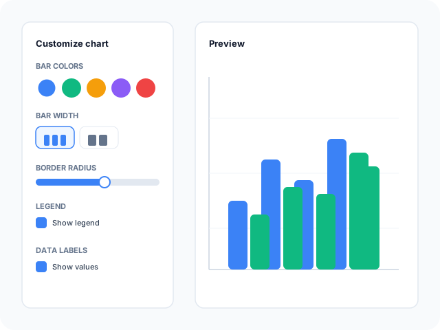
Export the frequency chart
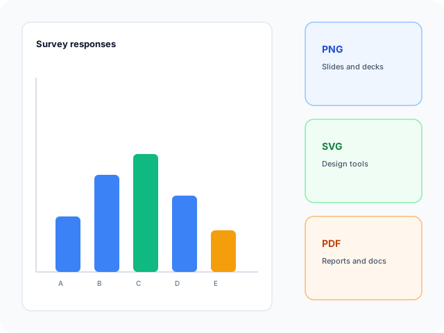
Download PNG for a slide, SVG for a design file, or PDF for a lab report. The bin labels you type are the ones in the export.
Frequency layout
Start from the histogram template, or switch to a bar chart when labels are names rather than ranges.
- HistogramTen equal score ranges from 0-10 through 90-100. Replace the counts with your own frequencies.
- Bar chartUse separate category bars when you compare products, regions, or answers instead of numeric bins.
Where frequency bins help
A histogram answers how values are spread, not which named category is largest.
Test scores
Count how many students land in each ten-point range.
Response times
See whether requests cluster under a threshold or stretch into a long tail.
Measurement error
Show how repeated measurements fall around a center.
What you edit
Bin labels and counts live in the same table as other bar charts.
Equal-width bins
Keep intervals the same width so bar height is a fair picture of frequency.
Tight gaps
The template keeps bars close together so the axis reads as a number line.
Export
Save PNG, SVG, or PDF after the bin labels are readable.
Tasks this page covers
How the histogram maker turns a frequency table into adjoining bars.
- Histogram maker
- Open the template, replace each range and count, and export. Bar height is the number of observations in that bin.
- Choose a bin width
- Wider bins smooth the shape. Narrower bins show more detail and more noise. The sample uses ten-point ranges.
- Histogram vs bar chart
- A histogram bins one continuous measure. A bar chart compares separate categories such as products or regions.
- Count the frequencies first
- Tally how many values fall in each range, then paste those counts. The editor draws the bars; it does not compute bins from a raw list.
How to make a histogram
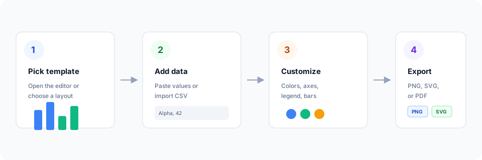
- Open the histogram template.
- Replace the range labels and the count in each bin.
- Keep the bins equal width and the gaps small.
- Export PNG, SVG, or PDF.
What is a histogram?
A histogram shows the distribution of one numeric measure. The horizontal axis is split into bins, and the height of each bar is how many values fall in that bin.
Unlike a bar chart, the labels are ranges of the same variable. Touching or nearly touching bars signal that the axis is continuous.
Histogram vs bar chart
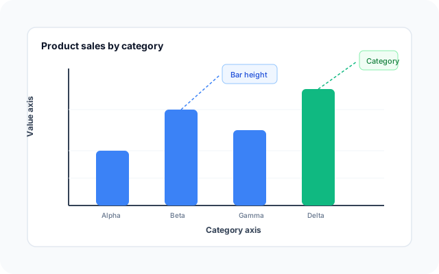
Use a histogram for the shape of a numeric distribution. Use a bar chart when each bar is a different category and the gaps between bars are meaningful.
Bar templates
The histogram sits with the bar templates. Open it when your axis is numeric ranges.
Related pages
Jump to the bar graph maker, box plots, and the chart-type guide.
Bar chart templates
Browse bar layouts, including the histogram template.
Bar graph maker
Compare named categories when bins are the wrong encoding.
What is a box plot?
Summarize the same distribution with median, quartiles, and whiskers.
Open the histogram template
Start in the editor with exam-score frequency bins.
Frequently asked questions
- How do I make a histogram?
- Open the histogram template, replace each bin label and count, and export PNG, SVG, or PDF.
- Does the histogram maker bin raw numbers for me?
- No. Count how many values fall in each range first, then paste those frequencies. The editor draws the bars from that table.
- What is the difference between a histogram and a bar chart?
- A histogram groups one continuous measure into ranges. A bar chart compares separate categories. Use the bar graph maker for products, regions, or survey answers.
- Should histogram bars touch?
- Yes, or nearly so. Small gaps keep the axis reading as a continuous scale. The template uses a tight category gap for that reason.