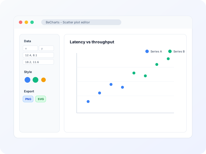
- Three columns: x position, y position, and circle size
- Shared axes so larger bubbles stay comparable
- PNG, SVG, or PDF export from the browser
- Switch back to a plain scatter plot when size is not needed
Three numbers per point
Each row needs an x value, a y value, and a size. The template maps size to circle area so a product with a larger margin draws a larger bubble.
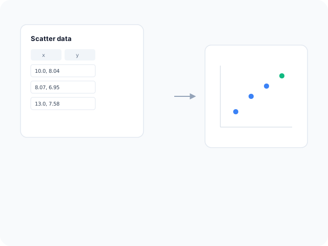
Position first, size second
Readers judge position more accurately than area. Put the main comparison on the axes and use bubble size for a supporting measure such as revenue or headcount.
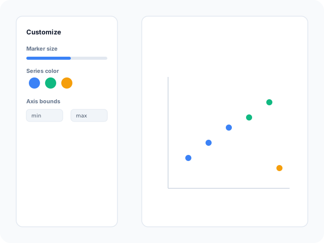
Export the sized plot
Download PNG for slides, SVG for design tools, or PDF for a report. The circle sizes you set in the editor stay in the file.
Start from a sized scatter layout
Open the bubble template, or use a plain scatter plot when you only have two columns.
- Bubble chartSeven sample products plot price against units sold. Circle area follows margin so the third measure is visible without a third axis.
- Scatter plotDrop the size column when every point should have the same marker. The scatter plot generator keeps x and y only.
When a third measure matters
Use a bubble chart when two positions are not enough and the extra number is a magnitude.
Product portfolios
Place price and volume on the axes and size bubbles by margin or revenue.
Market maps
Plot growth against share and size each circle by total sales.
City or site comparisons
Show two rates on the axes and scale bubbles by population or traffic.
What you edit
The same scatter editor, with size bound to a third column.
Size from data
The template maps the third value to circle diameter so you do not resize markers by hand.
Axis titles
Name the x and y measures so readers know what position means before they compare areas.
Export
Save PNG, SVG, or PDF after the bubbles no longer overlap into an unreadable mass.
Tasks this page covers
How the editor turns three numeric columns into a bubble chart.
- Bubble chart
- Open the bubble template, replace price, units, and margin, and export. Position carries the main comparison; area carries the third measure.
- Add a size column
- Keep x and y as the first two fields. The third field drives circle size through the template scale.
- Avoid a bubble map
- This chart is not a mind map or a geographic bubble map. It is an x-y plot with sized markers.
- When to use a scatter plot
- If you do not have a third measure, use the scatter plot generator so every point stays the same size.
How to make a bubble chart
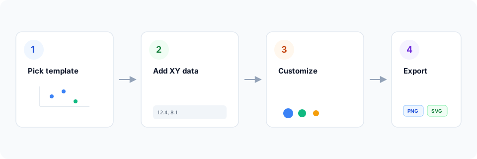
- Open the bubble chart template.
- Replace each row with your x value, y value, and size.
- Name the axes and check that large bubbles do not hide smaller ones.
- Export PNG, SVG, or PDF.
What is a bubble chart?
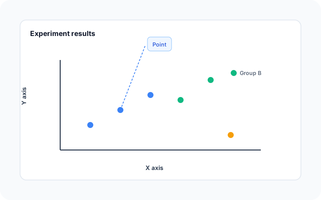
A bubble chart is a scatter plot with a third encoding. Horizontal position is one number, vertical position is another, and circle area is a third. Readers can see where a point sits and how large that extra measure is.
Area is harder to compare than position, so keep the size scale honest and avoid dozens of overlapping circles. If the third column does not change the decision, a scatter plot is clearer.
Bubble chart vs scatter plot
A scatter plot uses equal markers for two numbers. A bubble chart adds size. Use bubbles only when that third value is part of the question.
Scatter templates
The bubble layout lives with the other scatter templates. Open it when you have a size column.
Related pages
Jump to the scatter plot generator, templates, and the chart-type guide.
Scatter plot templates
Browse scatter layouts, including the bubble chart template.
Scatter plot generator
Plot x and y with equal markers when size is not part of the story.
What is a scatter plot?
Read correlation and outliers before you add a third measure.
Open the bubble template
Start in the editor with price, units, and margin sample rows.
More chart makers
Frequently asked questions
- How do I make a bubble chart?
- Open the bubble template, replace the three numbers on each row, name the axes, and export PNG, SVG, or PDF.
- What does bubble size mean?
- In this template, circle size follows the third column. The sample uses margin. Replace it with revenue, population, or another magnitude.
- Is a bubble chart the same as a scatter plot?
- They share x and y axes. A bubble chart also encodes a third value as area. Use the scatter plot generator when every point should be the same size.
- Can this draw a bubble map?
- No. A bubble map places circles on a geography or a mind-map layout. This tool plots numeric x and y axes only.